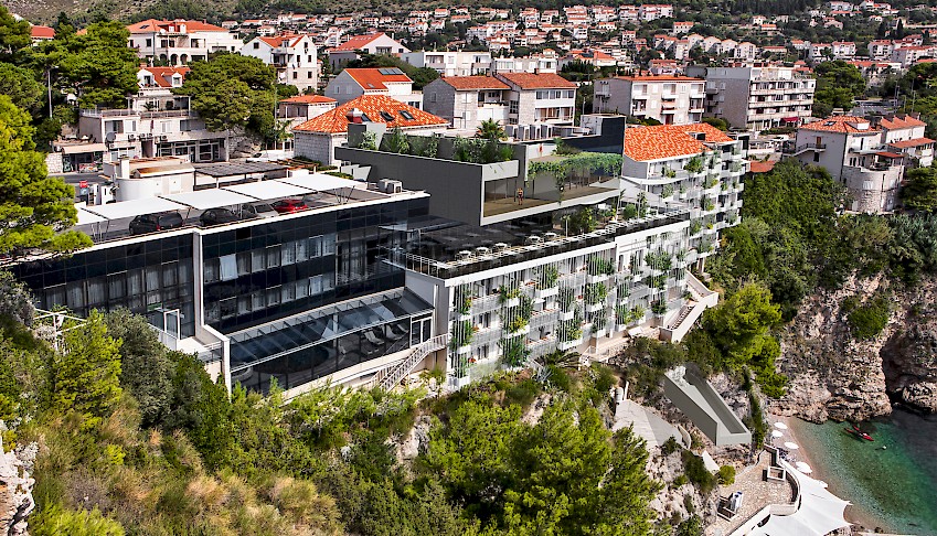
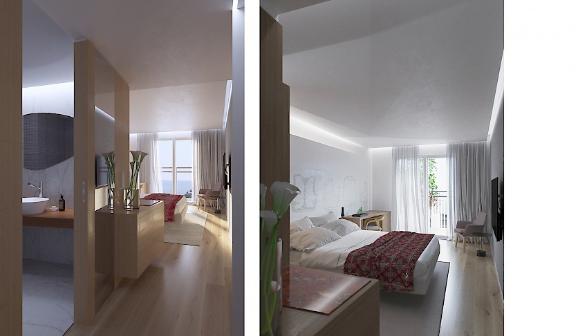
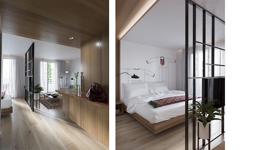
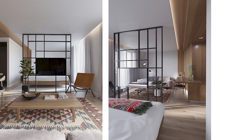
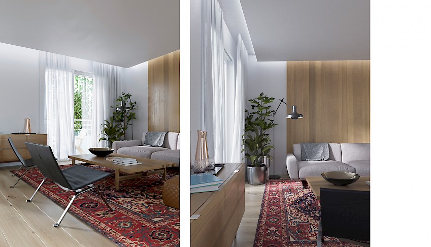
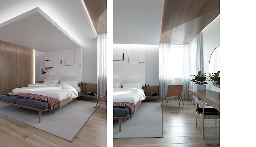
The renovation and furnishing of the accommodation units were approached with the intention of making the rooms more comfortable, functional and corresponding to its 5 star standards.
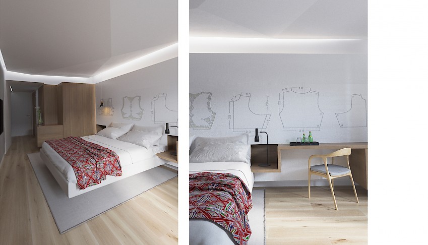
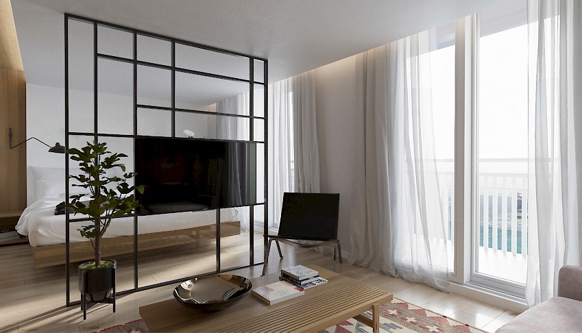
Because of the fact that most of the rooms are relatively small, we have tried to use panels, furniture, and lights to create spaces that are well-lit, elegant and bright. We propose materials that are light, such as light veneer. Wall panels and the embedded furniture are all lifted above the ground or there are physical gaps in between the elements. All of this contributes to the general sense of lightness and the feeling of “there is something behind” that psychologically makes the spaces larger. Lightning is extremely important here. It emphasizes the joints and lifts above the ground, ceilings, and other elements. The ceiling is partially lowered and in the bathroom, it is “cracked” downwards. Surfaces and embedded elements are not placed in right-angled compositions. This also enhances the feeling of the spaces being larger than they really are. The bathrooms are renovated by using sanitary elements that are state of art, simple, cladded in stone panels of grand formats that do not reach the ceilings.
The rooms that have terraces were ennobled with greenery outside the fence line and with little “Japanese” garden on the terrace surface.
As for the decorations in the rooms, we suggest different authentic motifs from Dubrovnik: traditional robes, drawings from the medieval manuscripts, different sorts of embellishments and jewelry… All these elements would be interpreted and redesigned.
---
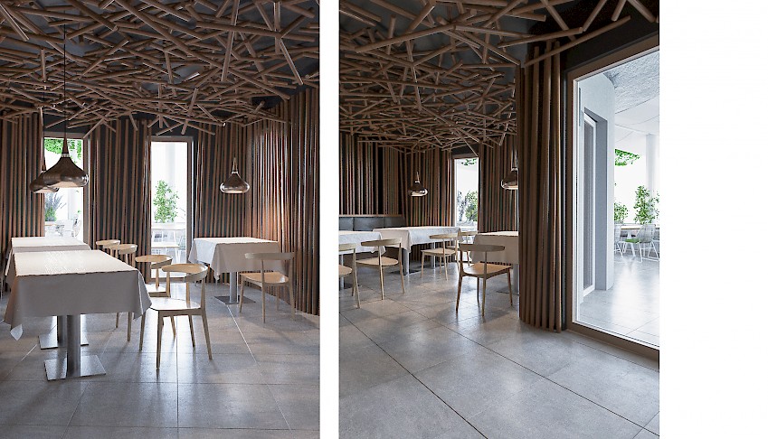
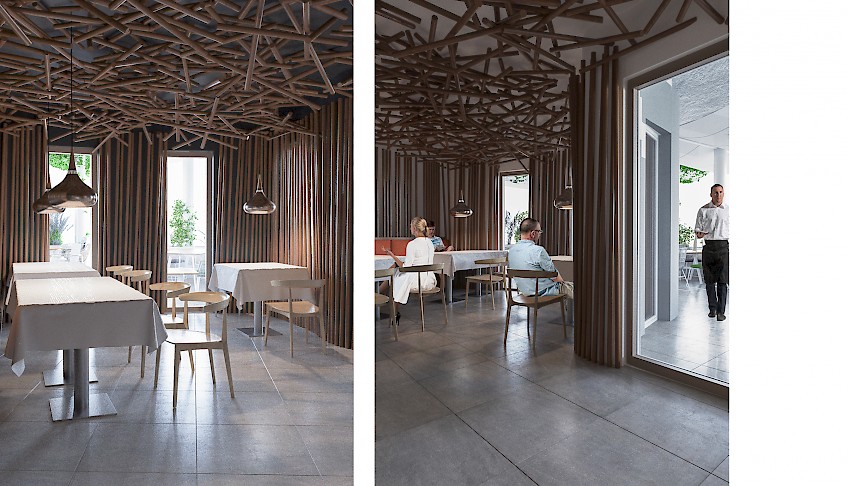
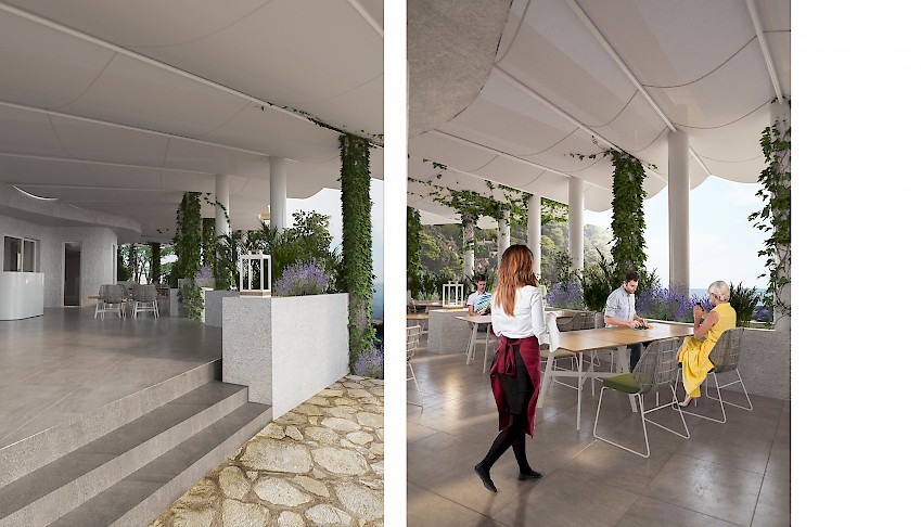
For the beach restaurant, we created comfortable spaces with natural materials. A new wooden pergola construction hovering over the open terrace with a covering made out of fabrics that directly sew the rain outwards should create a specific atmosphere.
Additional pots for the greenery on the terrace and the roof above the restaurant should add value to the feeling of the naturalness of this building intervention below the rocks.


