The apartment of a young businessman is located within a residential-business complex of a relatively recent, ambitiously designed infill building in Zagreb's Lower Town.A unique and privileged location next to the central city square provoked the developer to maximize the interior residential and business standards within the building in terms of the architectural expression, technological equipment and building maintenance if compared with the standard Croatian practice.Within such a framework, a young future resident purchased two adjacent residential units during the building shell construction stage with the intention of connecting the two units into an integral space with more luxurious proportions. The fortunate circumstance of this intervention was that the original design allowed the possibility of a relatively easy connection by demolishing a section of the wall filled with bricks within the reinforced concrete load-bearing wall. The two apartments were thus simply connected into a single space.The inverse design approach from the usual and routine practice, (where the existing floor plan is filled with an as large as possible programme) is here replaced by the freedom to formulate a simple design programme in just under 200 m2. This also required additional responsibility, since there is no place for justification of mistakes in this, for architects, rare and lucrative situation.The spatial organization of the load-bearing existing structure of connected residential units has largely defined the functional scheme. At the same time, by connecting two residential units into one, the basic requirements of housing, like the two-way orientation, a relation with the outside world, free flow of space and flexibility in functioning, are optimized.
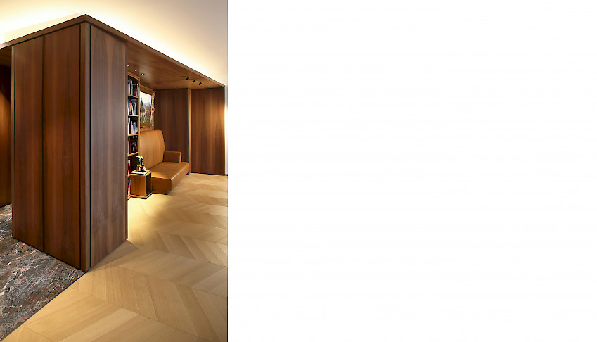
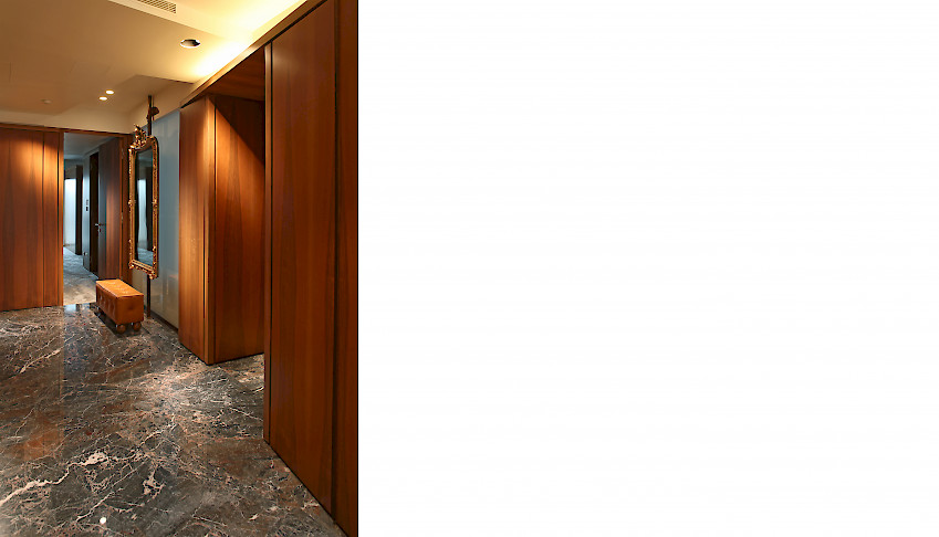
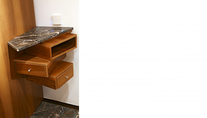
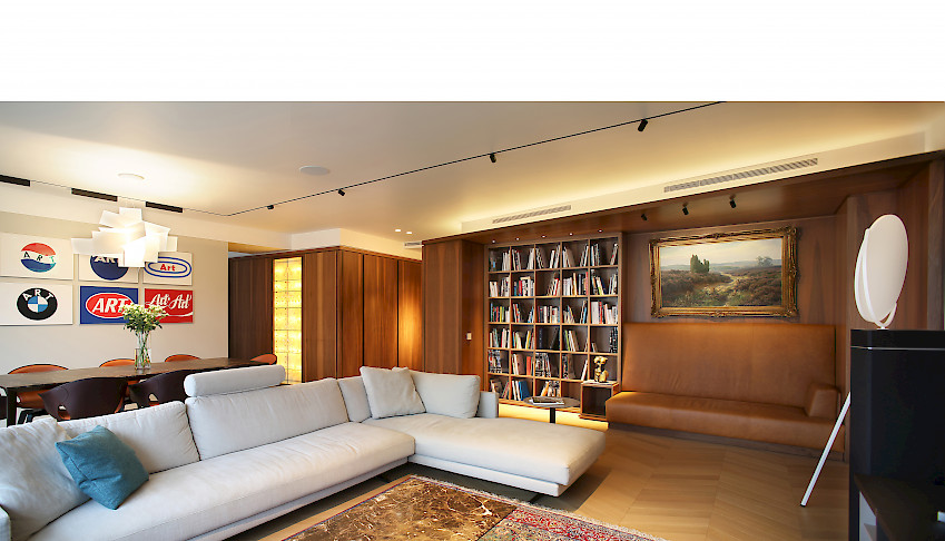
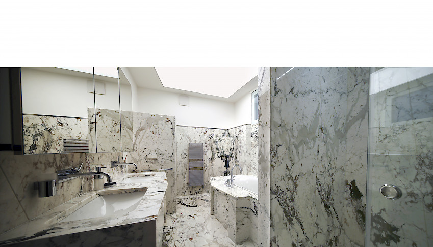
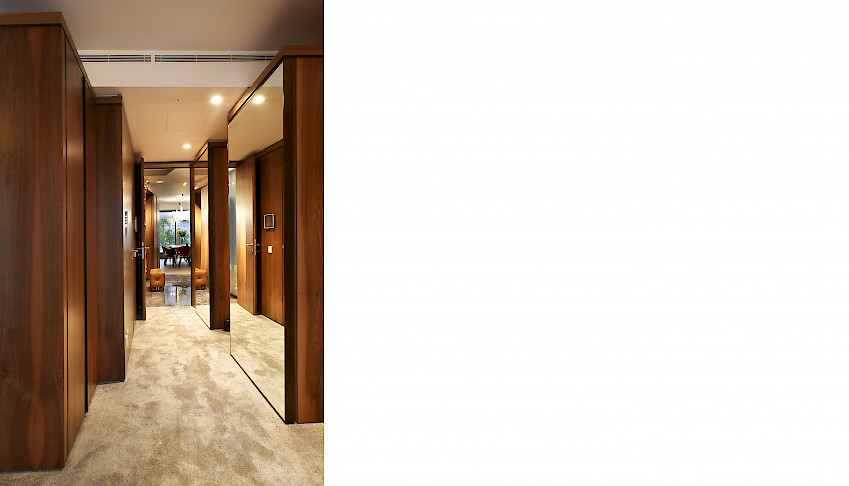
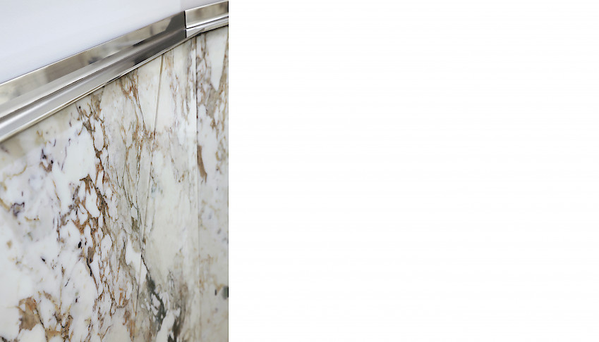
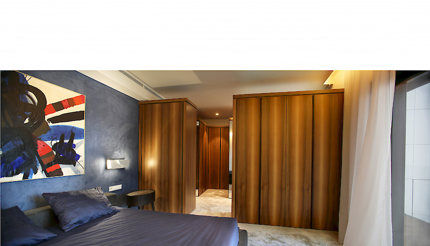
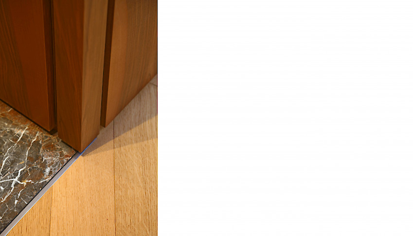
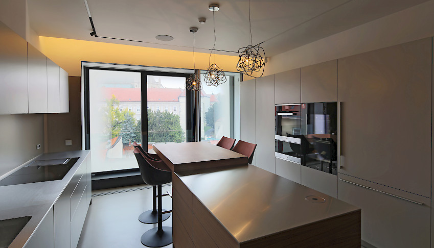
The logical solution in the given circumstances is the location of a private rest area, which includes a bedroom with a dressing room and bathroom, along a quieter, courtyard front, while the living area faces the public, noisier space of the square and the façade that offers a unique view of the Zagreb Cathedral towers.The living room and kitchen area are also connected to the service areas and the space that is functionally open for facilities such as a fitness room or a guest room, that is, children's room in the future.In order to provide additional noise protection coming from the square during frequent public events, additional sliding walls have been inserted, which rhythmically follow the existing façade division.Arranging the apartment was a process of orchestrating different parts in a harmonious dialogue - ambiences that were to awaken certain emotions, but also respond to the client's ambitions and aspirations.The existing concrete walls and rectangular geometric clarity are contrasted with the newly designed system of walls, linings, and mildly slanted partitions, finished in a fine walnut veneer, while the whiteness of the high ceilings contrasts with the low niches finished in the same way as the wall lining.When entered, the apartment is not experienced instantly, at first glance, in its entirety. Its horizontal and vertical gradation allows one to discover the view from the living room to the Cathedral towers, which is thus even more emphasized. In such an open and clear space, an element of syncope is inserted – a library niche with a built-in sofa, upholstered in cognac-coloured leather, which is finished in walnut veneer and intended for a retreat to a safe place and intimacy dedicated to reading and contemplation, rest. In the wooden paneling, great care was taken of detail, all visible in the alternation of wider and narrower joints in the vertical and horizontal directions that add rhythm to the wooden canvas. The rhythm is also contributed by the bronze handles placed all over the height of the cabinet door, as well as the lighting that accompanies and accentuates the rhythmic play.The play of light and shadow, accomplished by fine detailing of the surface, repeats itself on stone wall surfaces, where the joint between the stone slabs becomes funnelled, while its direction negates the verticality and regular rhythm of the wall lining. Everything becomes seemingly arbitrary and dynamic – but it is not.Stone is skin that is pulled onto the wall in such a way that the border between the wall and its lining is not hidden but emphasized and clearly separated by a stainless-steel L-profile detail.The tactile properties of the applied materials follow the manner in which the space is used, from the utilitarian nature of the cast floors and wall coatings, kitchen fronts in stainless steel, through the representative coldness of the stone floors in the entrance area, the warmth of the oak parquet in the living room, to the softness of the thick carpet and textile wall covering in the bedroom area.
The design aimed to create a home for a young contemporary businessman, while applying the experiences of traditional, comfortable and material-rich spaces.


